


This is a great up to date visualization of the relevant sea surface temperature anomalies and currents to El Nino.
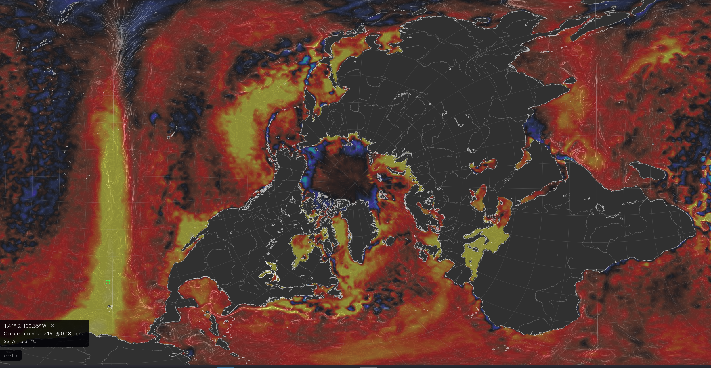
Ooof look at the sea surface temperature anomalies around and in the arctic too… The main equatorial expression of El Nino can be seen as the bright vertical line on the lefthand side of the image (that vertical line being the equator).
You must log in or # to comment.
Where is the data from?
NOAA, look on bottom left.
Been using it for years, love this site