

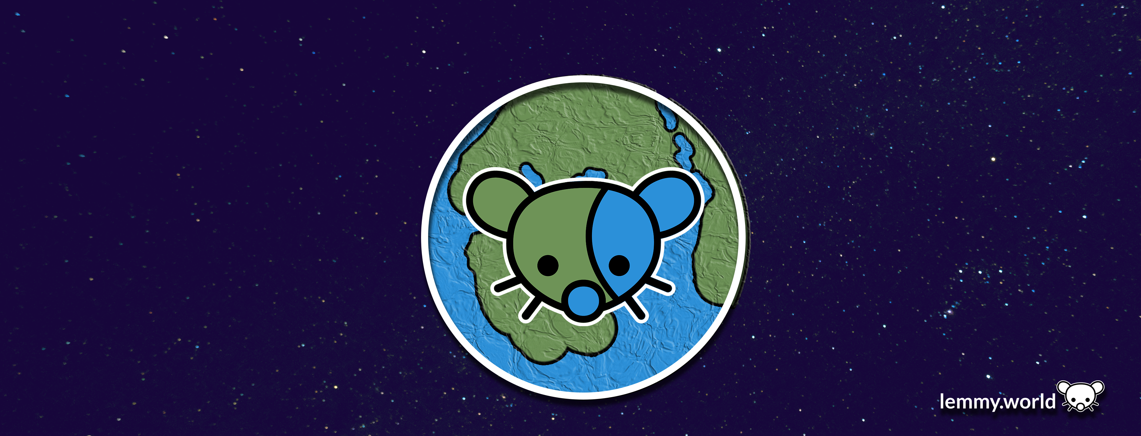
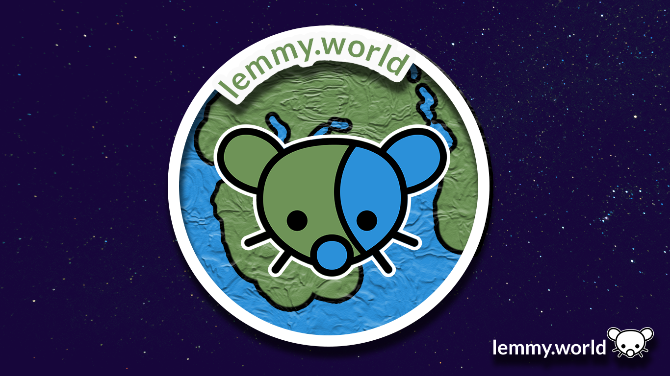
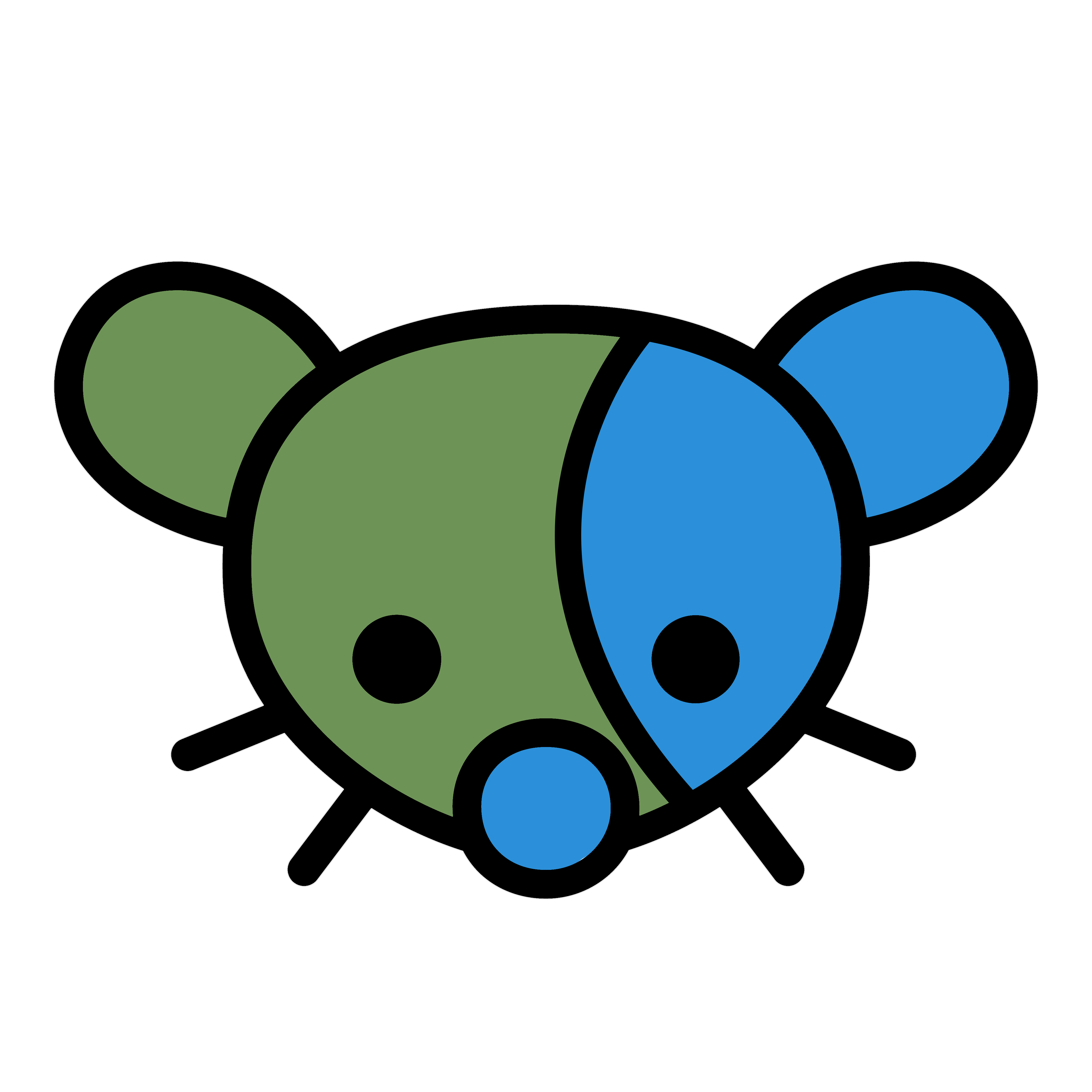
Here are some proposed graphics.


EDIT: I’ve now made a repository on GitHub, so that you can download the graphics and use them for your communities and projects. There’s even an Etsy store selling stickers now.
You: Which one do you like?
Me: Yes.

Biblically accurate lemmy
skeuomorphism go brrr
lol nice u/n. Also, thanks for the word. Haven’t heard it before and I’m a fan :D
That’s pretty sweet! Nice work
Thanks :3 OP did most of the work .
Stable Diffusion?
It’s the underlying tech in the open source AI image generation that started the explosion over the passed 6 months or so. If you want to play with it here’s a link to a community driven resource: https://aqualxx.github.io/stable-ui/
I made this 16x16 favicon (CC0 license)
Oh, what a wonderful addition! That’s a cutey if I’ve ever seen one @p1mrx@lemmy.world!
Are you working with the site admins to include this? It will require scaling the png to 25% size, and a line of HTML:
<link rel="icon" type="image/png" href="whatever.png" sizes="16x16">
🥹❤️
deleted by creator
The bottom two would make a nice favicon on my bookmarks bar!
Just wait until Ruud turns on custom emojis! Then we will really be cooking with gas.
2nd to last one. Simple is better.
Yup.
Trying to get a picture with smoother anti-aliasing for the site logo. The jagged edges really bug me.

SVG file: https://pastebin.com/6ywmisZK
Good edit. Thing is, I think there’s some compression going on in the backend, so even with an .SVG file, it might be somewhat complicated.
I’m going to probably make a quick GitHub page for the editing files with an .SVG, so the mod team, admin team and community managers can access all the files and edit them to spec.
But you’re right: the pixelation on the edges is causing my artist OCD to flare up. Good suggestion, Margot!
No problem!
looks clean and nice. good work.
Am I the idiot or is it really a penis next to its right cheek on the images with the globe? Maybe both.
Oh dear. Now that you mention it, I kinda see it too. Thanks for the flag: I’m… going to give it a think about how to shift it so that… isn’t there. Maybe in the second version.
Things look very different with a fresh eye. Its so funny when unintended naughty things show up in designs! https://genitalsornot.com/
I’m digging the last two. Simple and minimalist.
idk why but it reminds me of Little Big Planet, especially the second one
anyway they all look pretty good, but if it will be displayed on the page next to the title, I think only fourth one will be visible clearly without getting close to the screen or opening image in a new tab
For the original effort on Mastodon, the Little Big Planet vibe was indeed an inspiration. The ‘hand made’ aesthetic is a really neat way to share that a place is being created and made by its users, and having it be a tangible, almost print or paper product, I felt it touched that key cultural element of both Lemmy and the work of the fediverse/activitypub.
Both 1 & 2 look better on a web browser but on mobile the globe has a weird texture look to it. I like #1 as a banner and #5 for the icon. I will say I also like the current icon.
congrats man, your logo is now showing on this site
I’m pretty hyped. I still have some edits to do and items to add/shift, and to send over to Ruud later. But this is going both on the fridge and into the resume! 🤣
The bottom ones. Remind me of Braveheart 😃
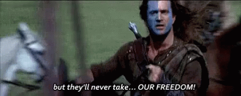
“They may take our third party apps…”
I like the three last most in order 3 5 4. I do also really like 1 and 2 but the texture on the planet makes them difficult and a bit weird to look at in a small size, at least from the look at the post thumbnail.
Here’s the logo with a brighter palette. In fact it was created using Mastodon Purple (#563ACC) as the root color for the new blue, and green colors so that “Ruud Worlds” harmonize.
Blue: 0/131/246
Green: 0/158/85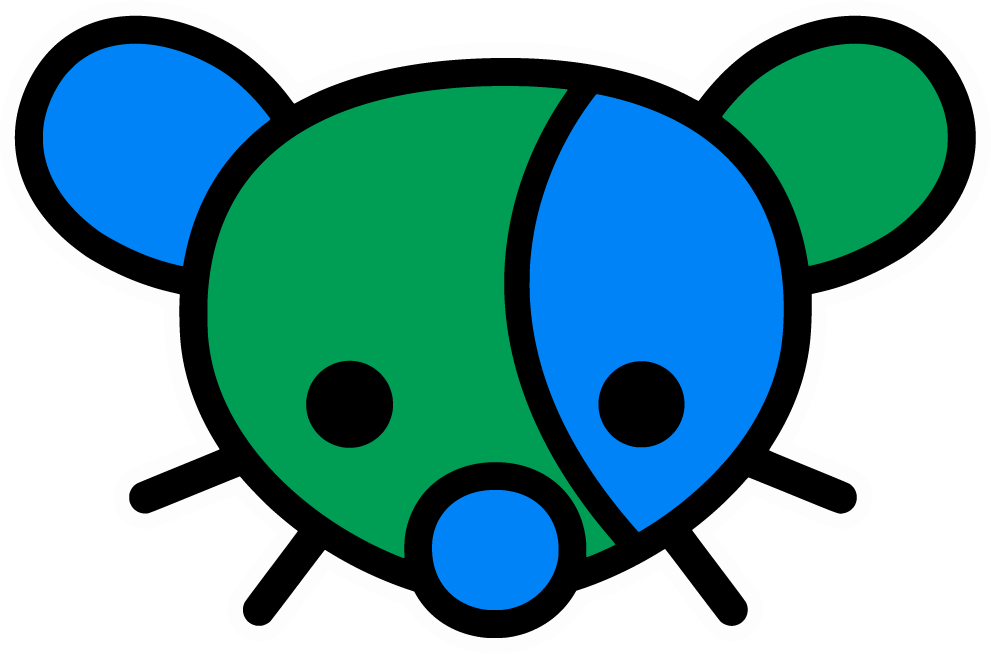


